A major feature slated to debut with vBulletin 4.0 is a new front-end style marked-up with semantic XHTML and styled with CSS.
The task of producing the new templates using this scheme has thrown up all manner of questions, challenges and show-stopping problems, one of which I will discuss here.
Background
In vBulletin 3.x, the primary markup vehicle was the HTML <table> tag and almost all elements on vBulletin pages could be summarized as having the following basic structure:
Using this scheme, there is semantically no more valueto the main heading than to any other tag in the block. Furthermore, the <table> tag and its contents strictly dictate how the element will appear; CSS has only a limited scope to change the fundamental structure of <table> elements.
It’s worth noting at this point that the use of the <table> tag for this (or any other) purpose does not mean that the markup is not valid XHTML. In fact, the majority of pages in vBulletin 3.x validate against the standard to which they are built, namely XHTML 1.0 Transitional.
However, it’s clear that a major part of a move to semantic XHTML will involve using more suitable markup for page elements, making use of tags that more accurately describe their content and contextualize it on the page.
Threadbit
One page that presents quite a conundrum is forumdisplay.php: the page that shows the list of threads in a forum. Let’s take a look at how the thread list has been presented in past versions.
Firstly, we have vBulletin 1.x.

Here, the thread data is presented in classic tabular fashion, with a single data point in each column, with the exception of the ‘Last Post’ column, where we show both the time and the writer of the most recent post to the thread in question.
This is how the thread list looked in vBulletin 2.x.
The data is still largely tabular, though we are starting to see content other than just the title in the ‘Thread’ column, namely the icon to represent a thread containing attachments and the ‘Poll:’ prefix.
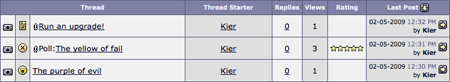
With vBulletin 3.x, there was an attempt to cut down the number of columns.
We can see that the name of the thread starter has moved into the same column as the thread title, placed on a new line. The rating stars have also migrated into the same column and there are several more icons representing different attributes of the thread.
The question is:
Is the vBulletin 3 thread list still tabular data?
At first sight, yes it is. We have a number of columns each containing data and the arrangement looks like a grid. But do we consider the thread list to be tabular data simply because it is arranged in this way?
If we extract all the data and put each individual item into its own column, as should arguably be the case in order for the use of <table> to be semantically correct, we would end up with the following columns:
The Requirements
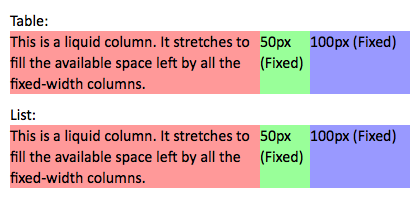
The basic structure I require visually is that of a table. I need a liquid column (one that stretches to occupy available space) followed by a number of fixed-width columns. Each column must be capable of supporting a background colour or image that will fill the cells.
The old way to achieve this would be to use a <table> tag with rows styled in the following way:
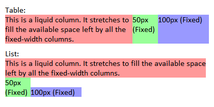
Of course, we want to avoid using a <table> tag if at all possible, given that our thread list is not strictly tabular data. Happily, most modern browsers give us an alternative that offers all the benefits of a <table> but without the semantic ambiguity, namely the CSS attribute display:table-cell. This would allow us to produce a layout visually identical to a table, but using semantic mark-up, such as this:
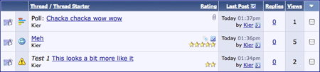
This screengrab shows how Firefox 3 renders the two different HTML snippets. It’s obvious that they are visually identical.
This markup allows radical restyling of the appearance of the thread listing and completely avoids the problematic <table> element. So, problem solved? Unfortunately not. There is one teeny tiny problem that is getting in the way of our goal. It’s called Microsoft Internet Explorer.
Making IE Work
Although support for display:table-cell has been introduced in Internet Explorer 8, the reality of the situation is that IE8 is not yet out of beta, leaving IE7 as the current primary version. What’s more, a significant portion of the web-browsing population is still using (shudder) IE6. Prior to IE8, display:table-cell is not supported at all in Internet Explorer. Given that Internet Explorer’s market share still represents a significant majority, there must be a workaround so that Internet Explorer users are not presented with a disastrous mess when they visit sites running vBulletin.
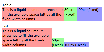
If we feed IE7 with the same CSS as we present to other browsers, IE7 will ignore the display:table-cell instruction, resulting in the cells being represented as horizontal blocks.
Inline-Block
Internet Explorer 7 does implement a CSS property that can offer some help in this instance, namely display:inline-block. We don’t want other browsers to see the inline-block instruction, so we will create a new stylesheet surrounded by Internet Explorer conditional comments.
Unfortunately, IE7 seems to have some bugs related to inline-block that need to be carefully prodded to make the system work. For some reason, a simple declaration of display:inline-block seems to have no effect, but it can be made to work by following it with a display:inline call. Yes, it’s that weird.
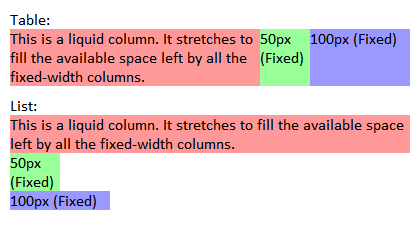
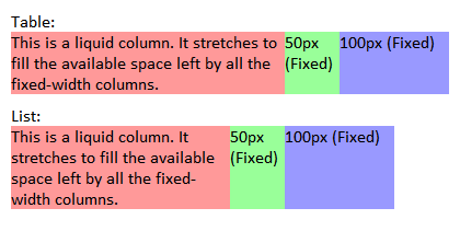
We can see from the preceding screengrab that IE is now attempting to place the blocks next to each other rather than stacking them vertically, but the liquid column is expanding to fill the whole width of the container, rather than only occupying the space left by the fixed columns. For the time being, we’ll fix this by specifying a fixed width for the liquid column. We’ll come back to the liquid problem later.
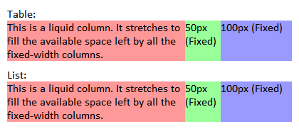
Finally, IE7 is displaying all the blocks horizontally in table fashion, but unlike a true table, the cells are not all of equal height.
Equal Height Cells
We start by specifying vertical-align:top for all cells, which will cause them to be aligned along a single top edge rather than the bottom edge.
The next task is to make all the cells of equal height – all must expand or contract automatically according to the natural height of the highest cell in the row.
We start by adding a massive amount of padding (9999px) to the bottom of all cells, such that it will extend well past the bottom of the browser window. We then reign that back in with a negative value (-9999px) for the bottom margin. This will look extremely strange and drop all the cells of the bottom of the page, until we instruct the row to hide any overflowed content.
Single Liquid Cell
We now have (what looks like) cells of equal sizes, which expand and contract vertically as they should. The last thing that remains is to get our liquid column working.
Internet Explorer supports expressions in CSS, which is a very powerful system allowing CSS values to be generated by Javascript. We will make use of this system to calculate the amount of space left in the row container after the fixed width cells have been inserted. The remaining width will be applied to the liquid column. I wrote a little function called liquid_td to handle this.
No-Javascript Failsafe
Everything now looks correct, though our use of expression falls over if we encounter a visitor running Internet Explorer with Javascript disabled.
To handle this worst-case scenario, we must abandon our liquid-fixed-fixed layout and switch to a completely liquid system, specifying all the widths in percentages. This will require a further stylesheet, this time surrounded by <noscript> tags to hide it from browsers that don’t need it.
Unfortunately, this flings us headlong into Internet Explorer’s lack of common sense when it comes to math calculations. One might expect that 60% + 15% + 25% = 100%, but Internet Explorer disagrees from time to time. The problem appears to be one of unintelligent rounding. Here are a pair of examples that illustrate the problem.
Example 1: Container width = 400px.
Conclusion and Discussion
Our final system works like this:
So, now we have a working system to emulate table cell behavior in our target browsers.
The task of producing the new templates using this scheme has thrown up all manner of questions, challenges and show-stopping problems, one of which I will discuss here.
Background
In vBulletin 3.x, the primary markup vehicle was the HTML <table> tag and almost all elements on vBulletin pages could be summarized as having the following basic structure:
HTML:
    <table class="tborder">
<tr>
    <td class="tcat">Main heading</td>
</tr>
<tr>
    <td class="thead">Sub-heading</td>
</tr>
<tr>
    <td class="alt1">Some content</td>
</tr>
<tr>
    <td class="alt2">Some more content</td>
</tr>
<tr>
    <td class="tfoot">Block footer</td>
</tr>
</table>
<br />It’s worth noting at this point that the use of the <table> tag for this (or any other) purpose does not mean that the markup is not valid XHTML. In fact, the majority of pages in vBulletin 3.x validate against the standard to which they are built, namely XHTML 1.0 Transitional.
However, it’s clear that a major part of a move to semantic XHTML will involve using more suitable markup for page elements, making use of tags that more accurately describe their content and contextualize it on the page.
Threadbit
One page that presents quite a conundrum is forumdisplay.php: the page that shows the list of threads in a forum. Let’s take a look at how the thread list has been presented in past versions.
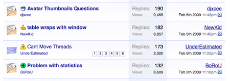
Firstly, we have vBulletin 1.x.
Here, the thread data is presented in classic tabular fashion, with a single data point in each column, with the exception of the ‘Last Post’ column, where we show both the time and the writer of the most recent post to the thread in question.
This is how the thread list looked in vBulletin 2.x.
The data is still largely tabular, though we are starting to see content other than just the title in the ‘Thread’ column, namely the icon to represent a thread containing attachments and the ‘Poll:’ prefix.
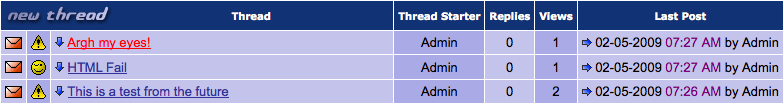
With vBulletin 3.x, there was an attempt to cut down the number of columns.

We can see that the name of the thread starter has moved into the same column as the thread title, placed on a new line. The rating stars have also migrated into the same column and there are several more icons representing different attributes of the thread.
The question is:
Is the vBulletin 3 thread list still tabular data?
At first sight, yes it is. We have a number of columns each containing data and the arrangement looks like a grid. But do we consider the thread list to be tabular data simply because it is arranged in this way?
If we extract all the data and put each individual item into its own column, as should arguably be the case in order for the use of <table> to be semantically correct, we would end up with the following columns:
- Status icon (read/unread, hot, moved, locked, posted-by-viewer)
- Post icon
- Prefix
- Title
- Thread poster
- Replies
- Views
- Rating
- Last post date / time
- Last poster
- Poll indicator
- Sticky indicator
- Attachment indicator
- Tag indicator
- Subscription indicator
- Deleted thread indicator
- Contains deleted posts indicator
The Requirements
The basic structure I require visually is that of a table. I need a liquid column (one that stretches to occupy available space) followed by a number of fixed-width columns. Each column must be capable of supporting a background colour or image that will fill the cells.
The old way to achieve this would be to use a <table> tag with rows styled in the following way:
HTML:
    <tr>
    <td bgcolor="#FF9999">(liquid column)</td>
    <td bgcolor="#99FF99" width="50">(fixed 1)</td>
    <td bgcolor="#9999FF" width="100">(fixed 2)</td>
    ...
</tr>
HTML:
    <style type"text/css">
.table { display:table; width:400px; }
.row   { display:table-row; }
.cell  { display:table-cell; }
.liquid { background:#FF9999; }
.fixed50 { background:#99FF99; width:50px; }
.fixed100 { background:#9999FF; width:100px; }
</style>
...
<li class="row">
    <h3 class="cell liquid">(liquid column)</h3>
    <div class="cell fixed50">(fixed 1)</div>
    <div class="cell fixed100">(fixed 2)</div>
    ...
</li>
This markup allows radical restyling of the appearance of the thread listing and completely avoids the problematic <table> element. So, problem solved? Unfortunately not. There is one teeny tiny problem that is getting in the way of our goal. It’s called Microsoft Internet Explorer.
Making IE Work
Although support for display:table-cell has been introduced in Internet Explorer 8, the reality of the situation is that IE8 is not yet out of beta, leaving IE7 as the current primary version. What’s more, a significant portion of the web-browsing population is still using (shudder) IE6. Prior to IE8, display:table-cell is not supported at all in Internet Explorer. Given that Internet Explorer’s market share still represents a significant majority, there must be a workaround so that Internet Explorer users are not presented with a disastrous mess when they visit sites running vBulletin.
If we feed IE7 with the same CSS as we present to other browsers, IE7 will ignore the display:table-cell instruction, resulting in the cells being represented as horizontal blocks.
Inline-Block
Internet Explorer 7 does implement a CSS property that can offer some help in this instance, namely display:inline-block. We don’t want other browsers to see the inline-block instruction, so we will create a new stylesheet surrounded by Internet Explorer conditional comments.
Unfortunately, IE7 seems to have some bugs related to inline-block that need to be carefully prodded to make the system work. For some reason, a simple declaration of display:inline-block seems to have no effect, but it can be made to work by following it with a display:inline call. Yes, it’s that weird.
HTML:
    <--[if lt IE 8]>
<style type="text/css">
.cell {
    display:inline-block;
}
.cell {
    display:inline;
}
</style>
<![endif]-->
We can see from the preceding screengrab that IE is now attempting to place the blocks next to each other rather than stacking them vertically, but the liquid column is expanding to fill the whole width of the container, rather than only occupying the space left by the fixed columns. For the time being, we’ll fix this by specifying a fixed width for the liquid column. We’ll come back to the liquid problem later.
Finally, IE7 is displaying all the blocks horizontally in table fashion, but unlike a true table, the cells are not all of equal height.
Equal Height Cells
We start by specifying vertical-align:top for all cells, which will cause them to be aligned along a single top edge rather than the bottom edge.
The next task is to make all the cells of equal height – all must expand or contract automatically according to the natural height of the highest cell in the row.
We start by adding a massive amount of padding (9999px) to the bottom of all cells, such that it will extend well past the bottom of the browser window. We then reign that back in with a negative value (-9999px) for the bottom margin. This will look extremely strange and drop all the cells of the bottom of the page, until we instruct the row to hide any overflowed content.
HTML:
    <!--[if lt IE 8]>
<style type="text/css">
.row {
    overflow:hidden;
}
.cell {
    display:inline-block;
    vertical-align:top;
    padding-bottom:9999px;
    margin-bottom:-9999px;
}
.cell {
    display:inline;
}
</style>
<![endif]-->
Single Liquid Cell
We now have (what looks like) cells of equal sizes, which expand and contract vertically as they should. The last thing that remains is to get our liquid column working.
Internet Explorer supports expressions in CSS, which is a very powerful system allowing CSS values to be generated by Javascript. We will make use of this system to calculate the amount of space left in the row container after the fixed width cells have been inserted. The remaining width will be applied to the liquid column. I wrote a little function called liquid_td to handle this.
HTML:
    .liquid {
    width:expression(liquid_td(this));
}
No-Javascript Failsafe
Everything now looks correct, though our use of expression falls over if we encounter a visitor running Internet Explorer with Javascript disabled.
To handle this worst-case scenario, we must abandon our liquid-fixed-fixed layout and switch to a completely liquid system, specifying all the widths in percentages. This will require a further stylesheet, this time surrounded by <noscript> tags to hide it from browsers that don’t need it.
Unfortunately, this flings us headlong into Internet Explorer’s lack of common sense when it comes to math calculations. One might expect that 60% + 15% + 25% = 100%, but Internet Explorer disagrees from time to time. The problem appears to be one of unintelligent rounding. Here are a pair of examples that illustrate the problem.
Example 1: Container width = 400px.
- 60% of 400 = 240
- 15% of 400 = 60
- 25% of 400 = 100
- 240 + 60 + 100 = 400.
- Result: all columns fit.
- 60% of 399 = 239.4, rounds to 240
- 15% of 399 = 59.85, rounds to 60
- 25% of 399 = 99.75, rounds to 100
- 240 + 60 + 100 =400
- Result: last column drops because 400 pixels do not fit into 399 pixels.
Conclusion and Discussion
Our final system works like this:
HTML:
   <style type"text/css">
.table { display:table; width:400px; }
.row   { display:table-row; }
.cell  { display:table-cell; }
.liquid { background:#FF9999; }
.fixed50 { background:#99FF99; width:50px; }
.fixed100 { background:#9999FF; width:100px; }
</style>
<!--if lt IE 8]>
<style type="text/css">
.row {
    overflow:hidden;
}
.cell {
    display:inline-block;
    vertical-align:top;
    padding-bottom:9999px;
    margin-bottom:-9999px;
}
.cell {
    display:inline;
}
.liquid {
    width:expression(liquid_td(this));
}
</style>
<noscript>
<style type="text/css">
.liquid { width:59.9%; /* we actually want 60% */ }
.fixed50 { width:15%; }
.fixed100 { width:25%; }
</style>
</noscript>
<![endif]-->
")