I've used a couple of different sources to devise a hybrid CSS speech bubble setup but am having difficulty with the positioning of a title under each bubble (see screenshot below for how it looks and the changes I'd like to make).
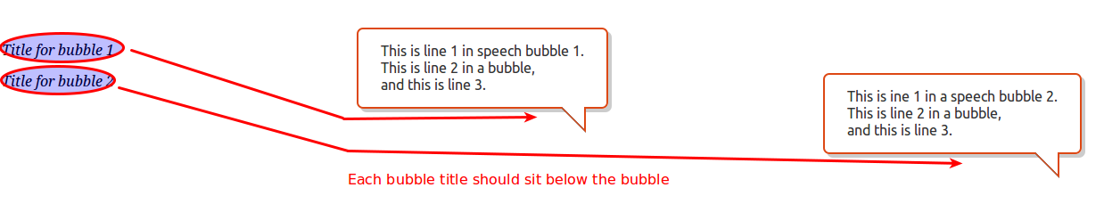 I used this as my inspiration for the bubble itself and this as my inspiration for having the title appear underneath the bubble - and herewith a big thank you to Joshua Hibbert and Nicolas Gallagher for their respective work. The \[code\].bubble + p\[/code\] CSS looks very compact but I can't get it to work properly with my setup. I've tried changing the \[code\]position\[/code\] attribute from \[code\]relative\[/code\] to \[code\]absolute\[/code\] and back again but neither works as hoped. Fiddle here (drag the Fiddle's Result slider to the left to see the bubbles displayed as intended). Can anyone please indicate what I can do? And am I right in presuming that the \[code\]+ p\[/code\] in the CSS means that the \[code\]<p>\[/code\] element inherits its CSS from the bubble element?HTML\[code\] <span class="bubble bubble-left">This is line 1 in speech bubble 1.<br/> This is line 2 in a bubble,<br/> and this is line 3.</span> <p>Title for bubble 1</p> <span class="bubble bubble-right">This is ine 1 in a speech bubble 2.<br/> This is line 2 in a bubble,<br/> and this is line 3.</span> <p>Title for bubble 2</p>\[/code\]CSS\[code\].bubble {background-color: #fff;-webkit-border-radius:7px;-moz-border-radius:7px;border-radius: 7px;border: 2px solid #DD4814;-webkit-filter: drop-shadow(4px 4px 5px rgba(0,0,0,0.5));-moz-filter: drop-shadow(4px 4px 5px rgba(0,0,0,0.5));-ms-filter: drop-shadow(4px 4px 5px rgba(0,0,0,0.5)); -o-filter: drop-shadow(4px 4px 5px rgba(0,0,0,0.5));box-shadow: inset 0 1px 1px hsla(0,0%,100%,.5), 4px 4px 0 hsla(0,0%,0%,.2);color: #333;display: inline-block;font-family: Ubuntu, sans-serif;font: 16px/25px;padding: 15px 25px;position: absolute;}.bubble + p {margin:15px 0 2em 85px; font-style:italic;}.bubble:after, .bubble:before {border-bottom: 25px solid transparent;border-right: 25px solid #fff;bottom: -25px;content: '';position: absolute;right: 25px;}.bubble:before {border-right: 25px solid hsla(0,0%,0%,.1);bottom: -28px;right: 22px;z-index: 1;}.bubble:before {border-right: 27px solid #DD4814;border-bottom: 27px solid transparent;bottom: -29px;right: 23px;z-index: 0;}.bubble-left {left: 25%;}.bubble-right {right: 25%;}\[/code\]